This meme is courtesy of the Viper Records Facebook page page, although it has circulated more broadly and it’s not clear where it first originated. At first glace it seems that not only is the food stamp program tiny, but that the majority of the Federal budget is military spending, with everything else being relegated to an afterthought. To anyone with even a basic understanding of US government spending, something should immediately seem wrong. There’s no pie slice for social security or medicare! That’s not exactly an insignificant portion of the budget.
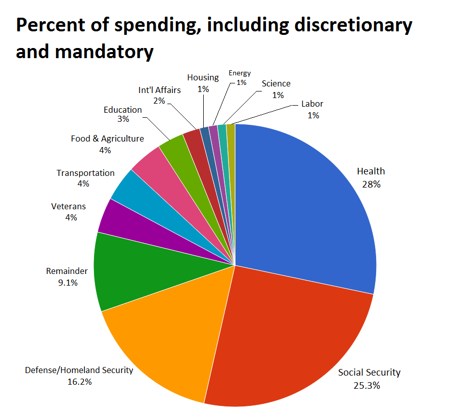
Politifact did a pretty good job of debunking this meme, and it appears this pie chart completely disregards mandatory spending, and only covers discretionary spending (although it’s even wrong on that, so not sure where they got their data!). Since mandatory spending is the bulk of the Federal budget, it changes things substantially. Of the roughly $3.9 trillion in spending, only 16% is for defense, while 53% is for social security and health services like medicare and medicaid. This isn’t to say we shouldn’t decrease military (or any other) spending, but the reality is completely different from the meme.
As far as the food stamp program, according to the Center on Budget and Policy Priorities we spent $76 billion on the SNAP program in 2014. While this amount fluctuates due to the amount of people who use the program, if we assume a $3.9 trillion budget, that’s about 2% of the federal budget, so this meme fails on that account as well. Be very skeptical of any pie chart showing the federal budget, as it’s extremely complex. Not only is there mandatory and discretionary spending, but there’s on and off-budget items, as well as paying the interest on the debt, which can fluctuate. The amount that is “budgeted” vs. actually spent is not the same, and usually it’s more. The government itself probably doesn’t know exactly how much it spends on everything! Below is a much more realistic chart from the Washington Post, but even this is likely not completely accurate.